
Regenerative Organic
This project was a collaboration with the Rodale Institute, Dr. Bronners and Patagonia Provisions to create a new graphic standard to recognize products that meet regenerative organic certification. Recognizable at all sizes and works across marketing, educational tools and small labelling on packaging.
The certification’s goal is to be viewed as the North Star of regenerative organic agricultural production, and is comprised of three modules related to soil health and land management, animal welfare, and farmer and worker fairness. The certification does not aim to replace other existing standards, like organic or biodynamic, but instead supplement them by leveraging the progress of past certifications and highlighting where additional improvements can benefit farmworkers, animals and soil.


Craftwater Engineering
A really fun rebrand logo and custom wordmark for a company that works directly with local and state government on maintaining healthy watersheds. I learned so much during this project, especially doing deep dives into competitors, colors, fonts and many, many directional comps.
In the end, we decided the floating “C” was an indicator representing the continued commitment to push forward bold ideas. The three lines of water shaped as “W” also relate to the pillars of the company they are focused on.
Science / Strategy / Engineering
Tin Shed Ventures™
Identity for Patagonia's corporate venture capital fund, which is used to invest in environmentally and socially responsible start-up companies. Design is inspired by the original tin shed that still stands on campus, and where Chouinard Climbing Equipment was born. Yvon still does blacksmith work inside.


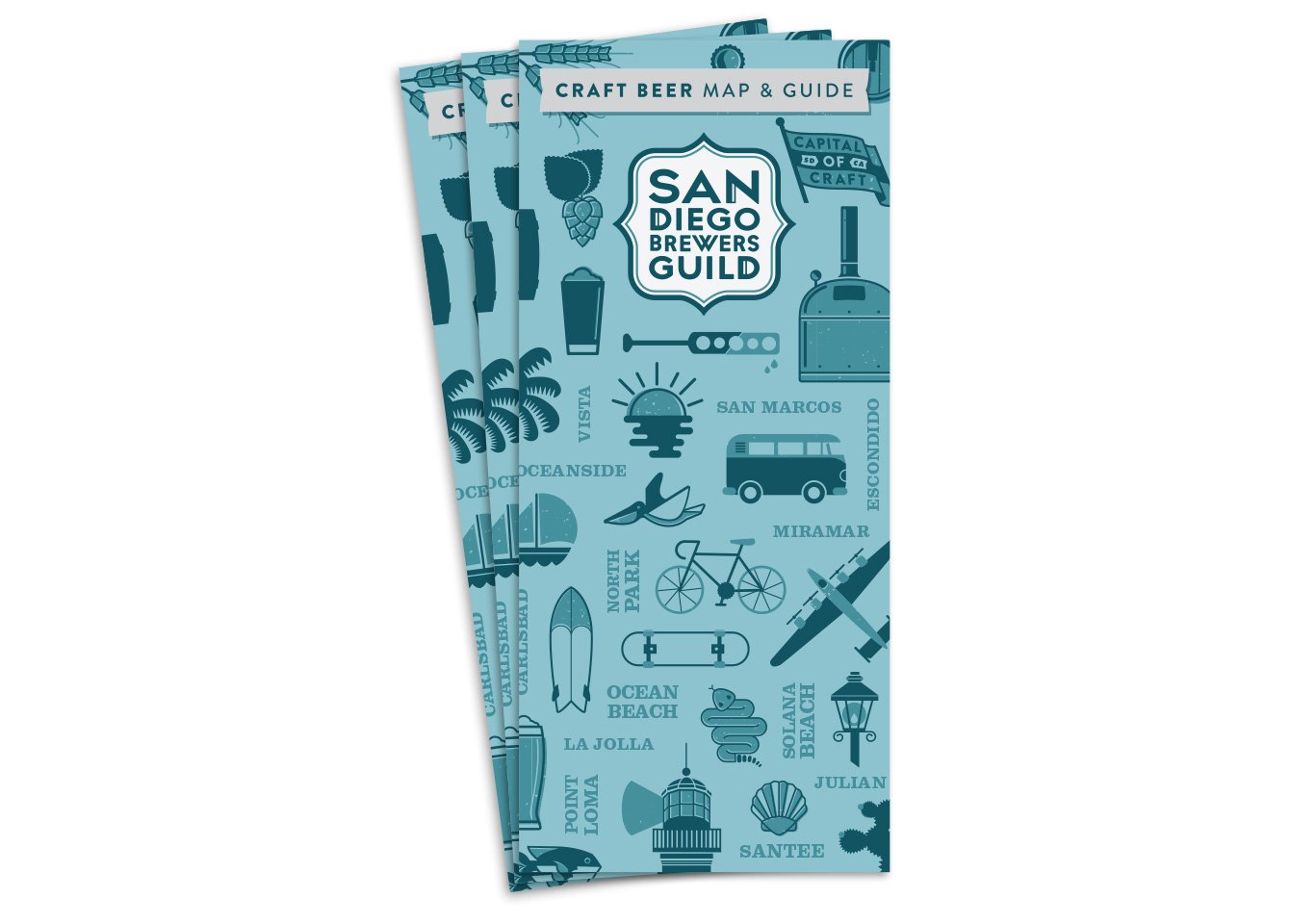
The refined logo is contained within an outer shape inspired by the historically present Spanish-style architecture found throughout the city. The various colors of blue are used to enforce the fact that San Diego has a rich history of ocean culture as a coastal county. A custom font was also created to balance the window through style and line weight.
Additionally, a series of illustrations were produced for marketing and events related to promoting the guild. The illustrative content has direct visual relationship to the culture of San Diego both in lifestyle and brewing process.
Creative Director:
Sean Kelley / Mother Sponge Inc.
San Diego Brewers Guild